Renovating your house is a great way to increase the value of the house. Sometimes, though, something goes very wrong between design and implementation process. These mix-ups and hacks can seriously make things complicated.
While some of these fails are not that big of a deal, such as a door being put on the wrong way or a light fixture placed in the wrong location, others have more far reaching implications. Examples include putting the kitchen or bathroom sink in the wrong location, stairways ending in the wrong place, and trees blocking off doors.
These hilarious home design fails show why it is important to learn what you are doing before modifying anything in your home. It also shows the importance of hiring a professional if you do not know what you are doing.
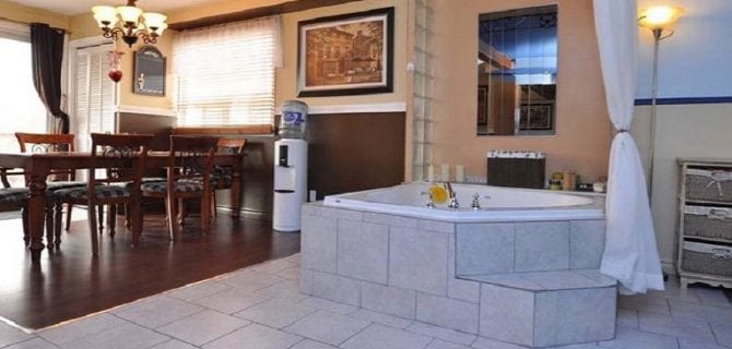
1) Just Taking a Bath in the Dining Room
This person decided that they wanted to take a bath literally right after dinner. At least it is a nice large tub. I wonder how they handle it when company visits, especially when the homeowner is not quite done with their bath yet.
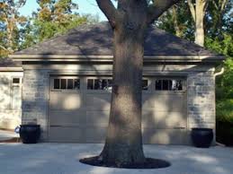
2) You’re Going Nowhere
This home has a tree in the middle of the driveway, which kind of defeats the purpose of having a garage. I guess you could get a small car past the tree, or even a bicycle.
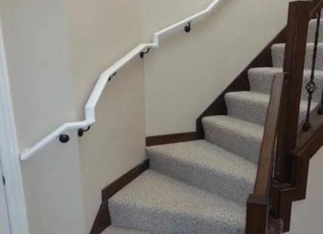
3) Crooked Stair
This odd set of stairs demanded that the homeowner get creative when installing a hand rail. If it was me, I would have skipped the handrail altogether. Unless the homeowner is old or likes to walk on that side of the stairs, there is really no reason to have a handrail there in the first place.
4) Enclosed Porch
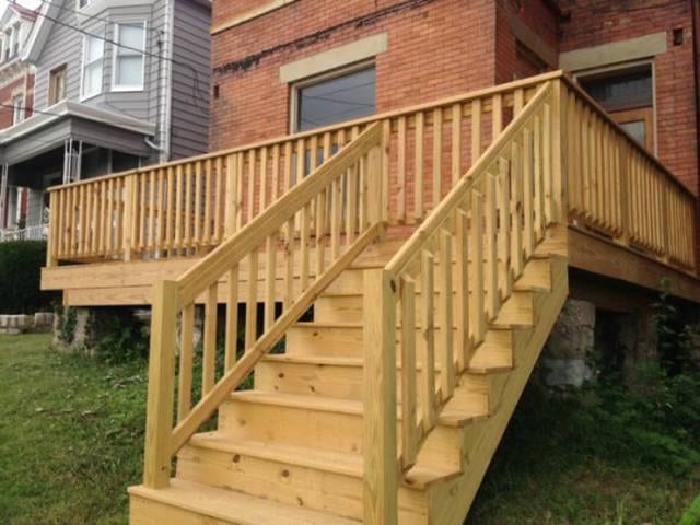
Here’s a head scratcher for you. Either this person really believes in security and doesn’t mind having to hop the railing of the porch every time he comes and goes, or someone really messed up. Luckily, this looks like an easy problem to fix with a saw.
5) Vertigo
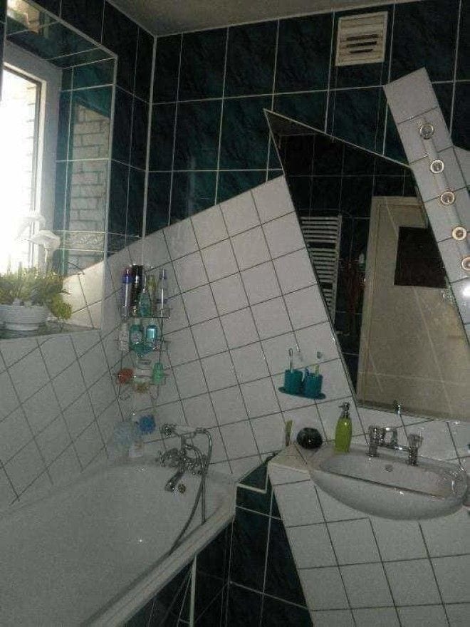
It looks like whoever designed this bathroom was drunk. Hopefully, they didn’t go in it while drunk after it was finished. This picture gives me vertigo just looking at it. Yikes!
6) Bad Placement 1
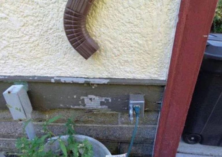
This is a bad placement for a downspout. it looks like they could have chosen to take it straight down, but chose to douse the plug instead. Hopefully, the homeowner doesn’t plug anything in during a rain storm.
7) Closed Off
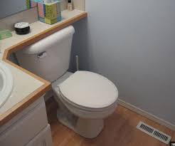
This homeowner better hope that the toilet does not break. Otherwise, they will have to do more than just remove the back cover of the toilet. They might have to do an extensive remodel.
8) Mirror, Mirror
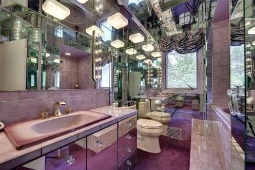
Here is a bathroom with a lot of mirrors. Talk about seeing everything from a variety of angles. At least it makes the bathroom appear roomier, though I think I could have done without the mirrors on the ceiling.
9) High Up
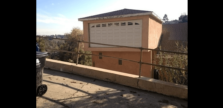
I’m still trying to figure out how the people who live here park in their garage. Is their last name Duke and do they drive a 1969 Dodge Charger? I mean really, just how did this design come about?
10) What Is Going on Here?
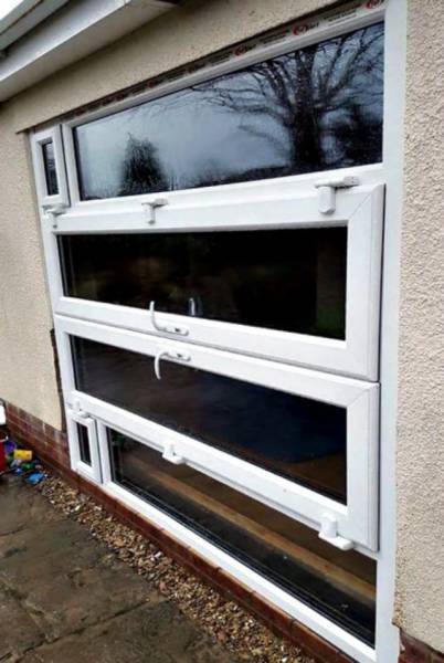
What exactly is going on with this door and where does it lead? It almost looks like the homeowner installed it sideways. The biggest question to me is do you enter by opening the two middle doors, or is it a foregone conclusion that whoever lives here doesn’t use this door.
11) Gaudy Home
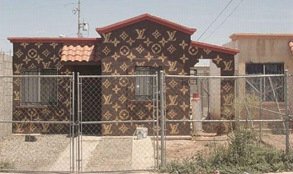
This homeowner must really love Louis Vuitton. It also looks like they wanted to protect their home by putting a fence around it. Either way, this home looks gaudy. I wonder if it is full of Louis Vuitton handbags inside.
12) Too Close for Comfort
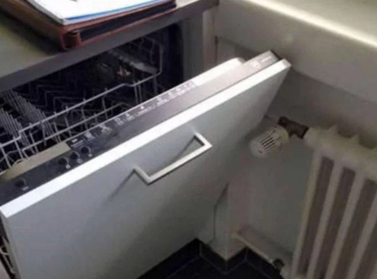
Here is an ill-advised placement of a radiator. Seriously, how is one to do the dishes in this situation. I guess you could slip them in one at a time, but it seems like that would get tedious after a while.
13) Header 13
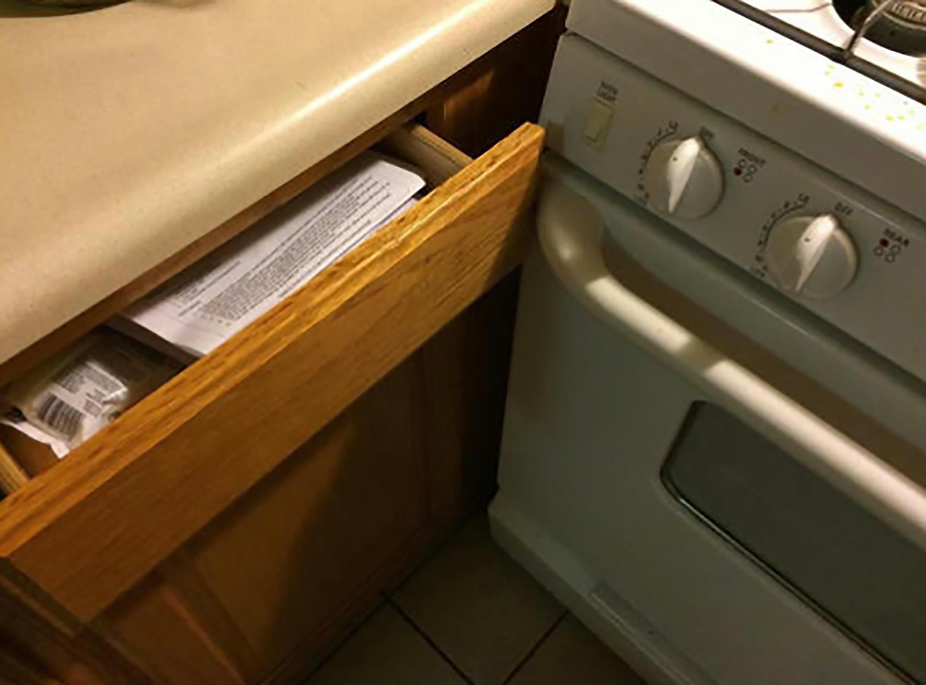
Here is another instance of bad appliance placement. Luckily, in this case, all you have to do is open the oven to open the drawer. Then again, if you are cooking something, things could get a little dicey having to open and close the oven whenever you want to get into the drawer.
14) Watch Your Step
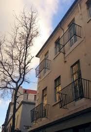
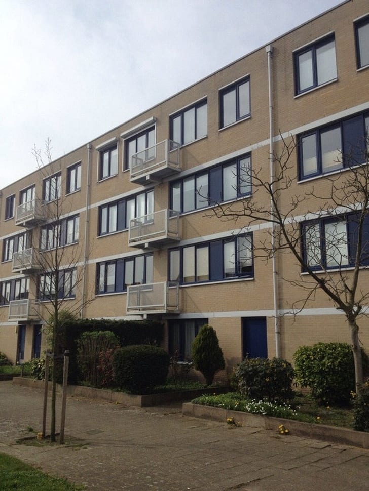
Whoever owns these apartments must have a high turnover rate. Chances are that tenants probably drop out all of the time. I just hope they have their insurance up to date.
15) Missing the Point
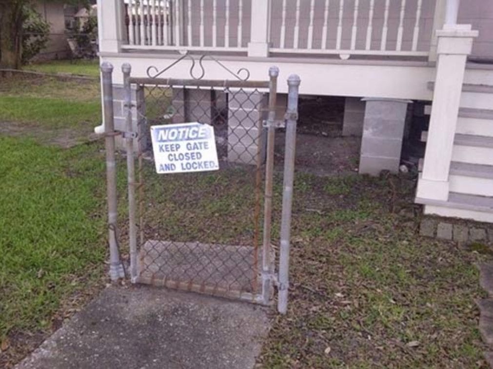
It looks like this homeowner needs to rethink his security strategy. A locked gate is only as good as the surrounding fence. In this case, I guess that would be not good at all.
16) Neck Crane
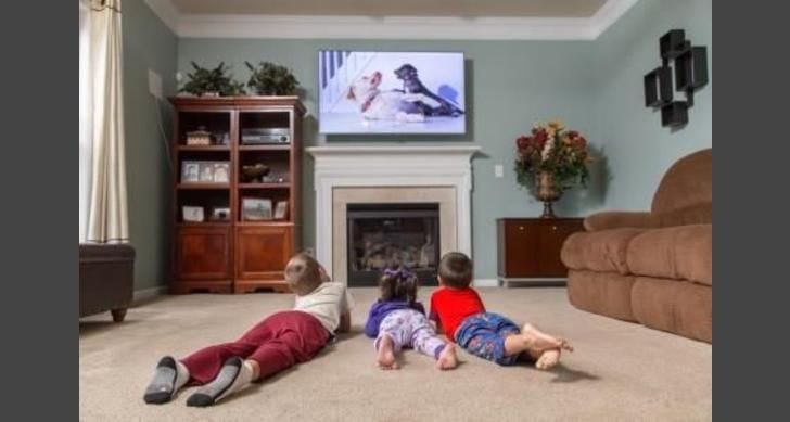
While this looks painful for the kids’ necks, they could always sit on the couch right next to them. As a matter of fact, some experts are against installing a TV over the fireplace. This is mostly due to the potential smoke damage they could suffer from.
17) Close Quarters
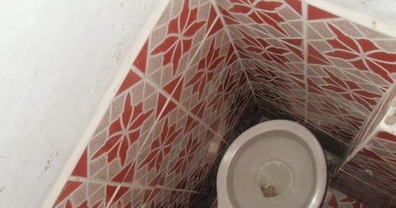
What is even the point of putting a toilet in this tiny room? Unless you plan on standing directly overhead, there is no way you could actually use it properly. I guess you could balance on the edge. Just make sure not to slip.
18) Columned Room
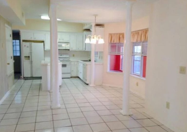
Talk about a lot of columns. This room has three of them. I’m assuming this is a kitchenette in the basement of a home. At least they have some space to move about.
19) No Way Out
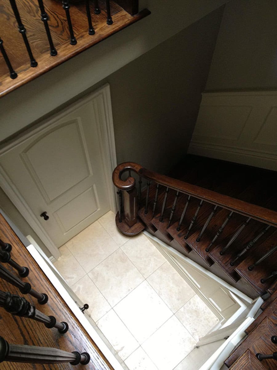
Count your lucky stars you don’t live in this house with the stairs that lead to nowhere. I still don’t see how they messed this one up, as it looks like a major miscalculation on the part of both the designer and the builder.
20) Missed the Mark
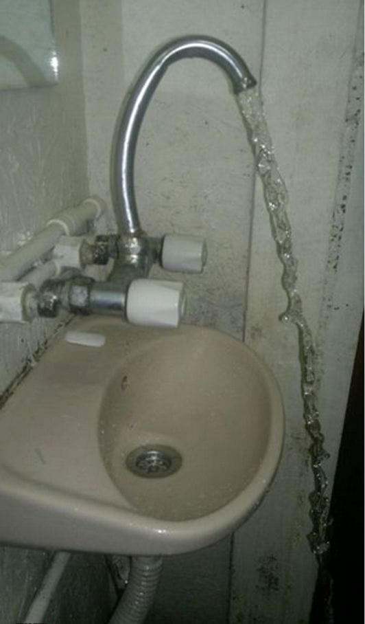
Well, it looks like the designer of this sink missed the mark. Not only did they miss getting the water in the sink completely, they almost made it impossible to stand next to the sink while the water is running without getting soaked in the process.
21) Almost
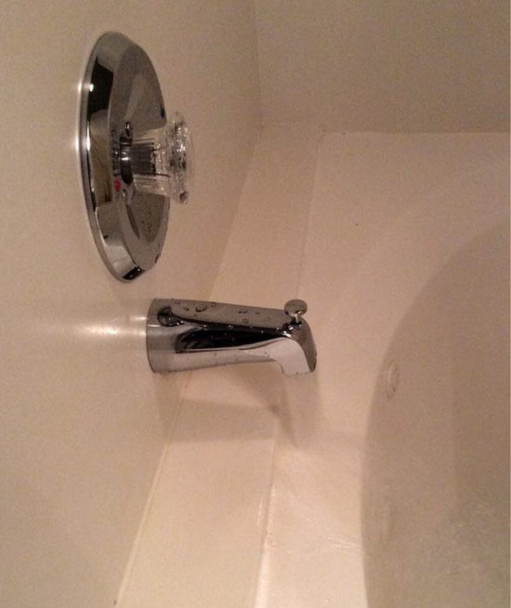
At least the installer of this bathtub tried. I mean, at least it is going into the tub. I just wonder if they ran out of longer faucets or if this is a miscalculation on the part of the installer.
22) Bad Placement 3
Here is another example of badly placed items. I guess if there are any ghosts in that building they have a cool placed to get some air while they haunt the living. Or the living could crawl out the window to get outside.
23) All Bricked Up
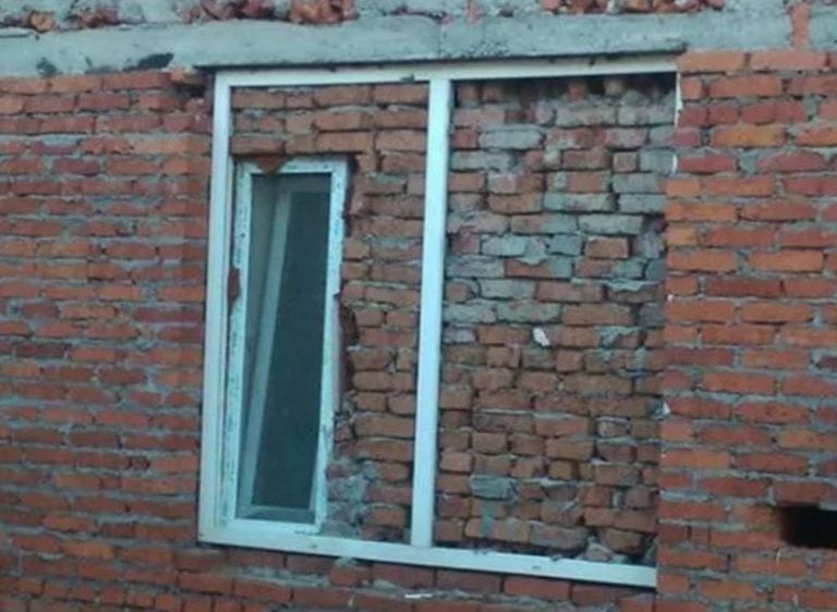
Here’s a strange sight, a bricked up window with a smaller window inside. Did whoever did this decide that they didn’t want the bigger window after they put it in? Maybe it was too much light, or, better yet, they had a bunch of extra bricks.
24) Kitchen Bath
Here is another family with the bathroom in the kitchen. This is either a really small house, or this is a fad with some people. Either way, I would recommend avoiding using the bathroom while someone is cooking to avoid cross-contamination.
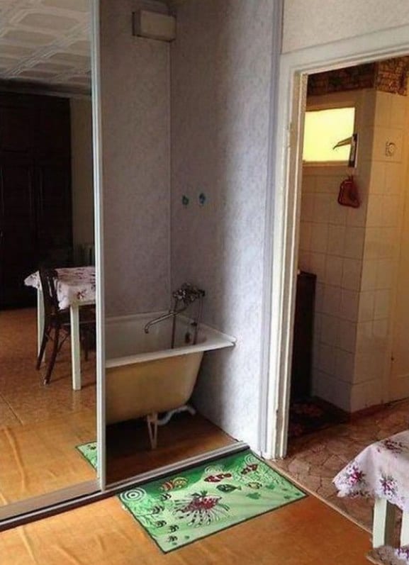
25) Bad Placement 4
What is this madness? A bathtub in the closet. This whole setup doesn’t even make sense to me. I’m just sitting here wondering what else they have shoved in that closet, and where exactly this is in the home, the basement.
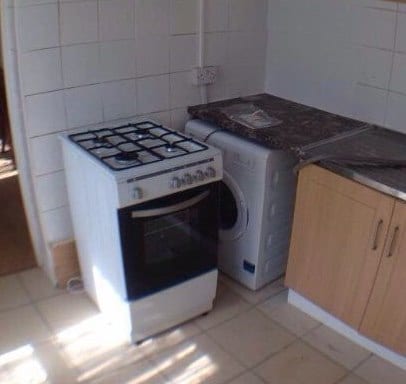
26) Nope!
Here’s a head scratcher for you. What is more important, eating or having dry clothing? It seems this person has chosen to eat while sitting in their wet clothing. Though I guess if you really wanted to have dry clothes you could just move the stove.
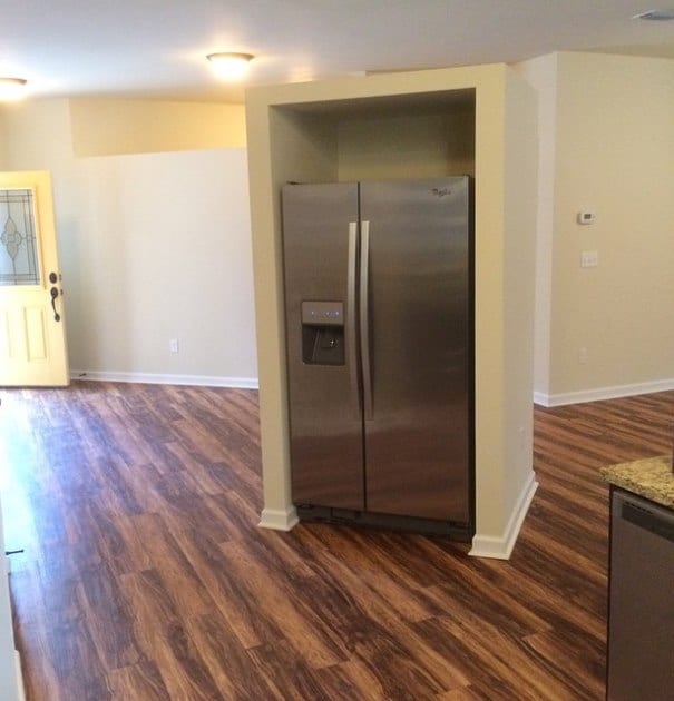
27) Refrigerator Island
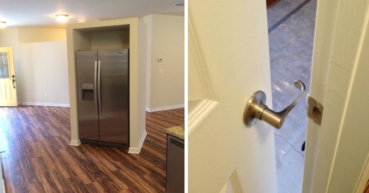
I am truly mystified as to why this homeowner felt it necessary, or even a good idea for that matter, to place the refrigerator in the middle of the room. Honestly, it would have been better to give up some counter space for the fridge and placed an island here instead.
28) Add-On
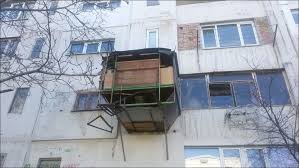
When you don’t have room for an expansion, but you make one anyway. I’m curious as to what that actually is, a room maybe, or just a glorified balcony? I wonder if it is up to code. Probably not.
29) Precarious Situation
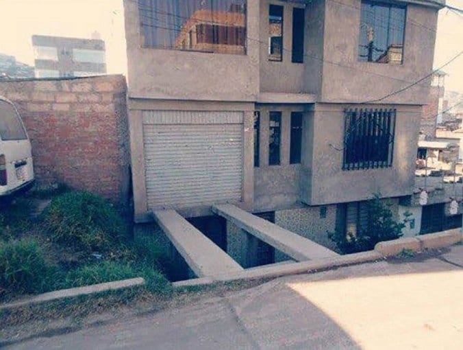
I hope whoever parks in this garage can drive. Just one slip up and they’ll be in the front yard. Who even thought this was a good idea in the first place? At least build a proper bridge. That doesn’t even look safe.
30) Steep Climb
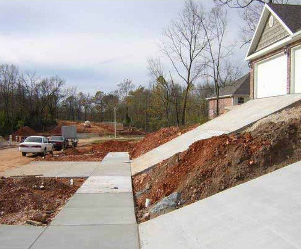
Talk about a steep driveway. Whoever lives here must have to get a running start to park their vehicle in the garage. And forget about it if it is slick or icy. Hopefully, they have a big truck because anything lower is going to bottom out going up that monstrosity.
31) Door Knob Fail
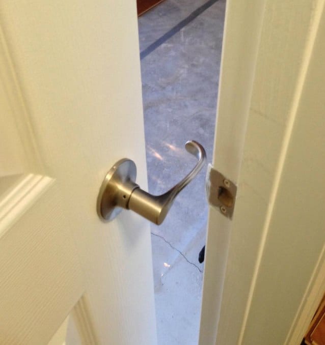
This is what you get when someone puts a latch-style doorknob in the wrong way. This was obviously installed by an amateur. Luckily, it is an easy fix. I just hope they didn’t install too many knobs like this, otherwise, it is going to be a long day.
32) Half Bath
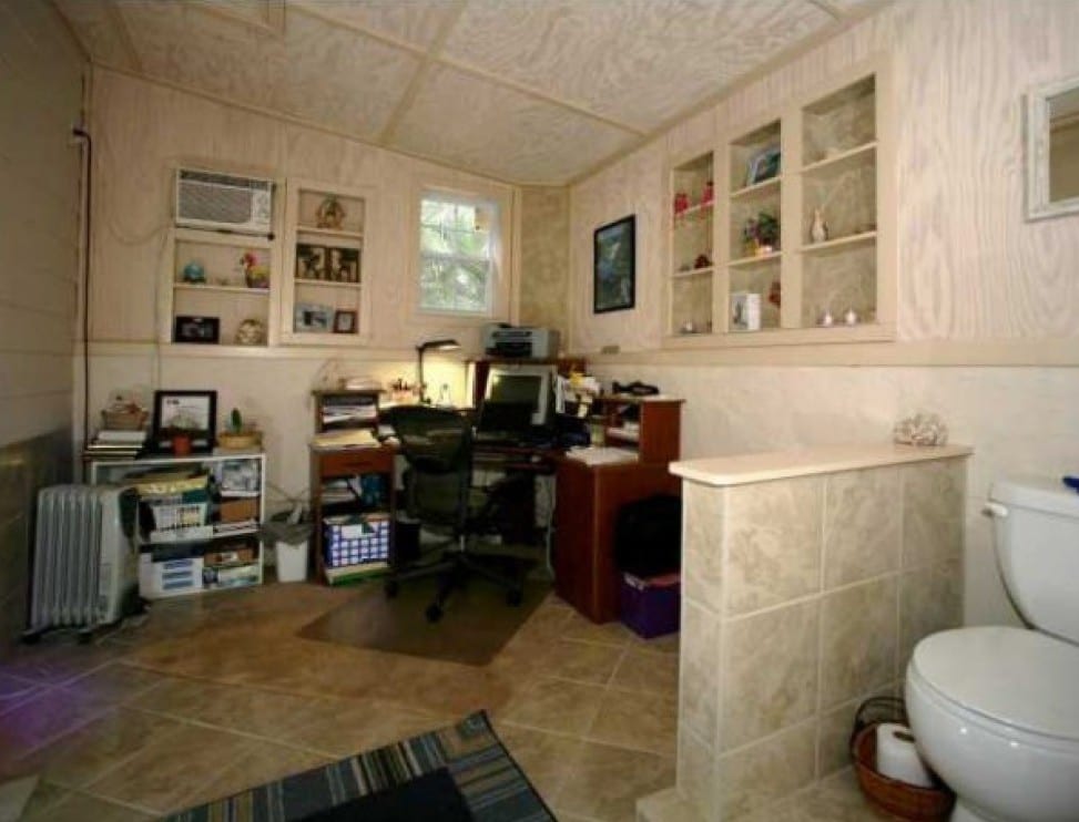
Here is another bathroom in a very visible area. I’m curious as to whether this room was an office or a bathroom first. At least you wouldn’t lose much work time when having to go to the bathroom.
33) DIY Sink
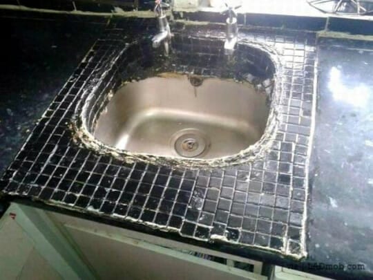
Talk about a rush job. Whoever installed this sink needed it installed right away, no matter how it looked. Hopefully, they at least got the plumbing hooked up correctly. I’m still wondering why they didn’t install it correctly initially.
34) Reach for It
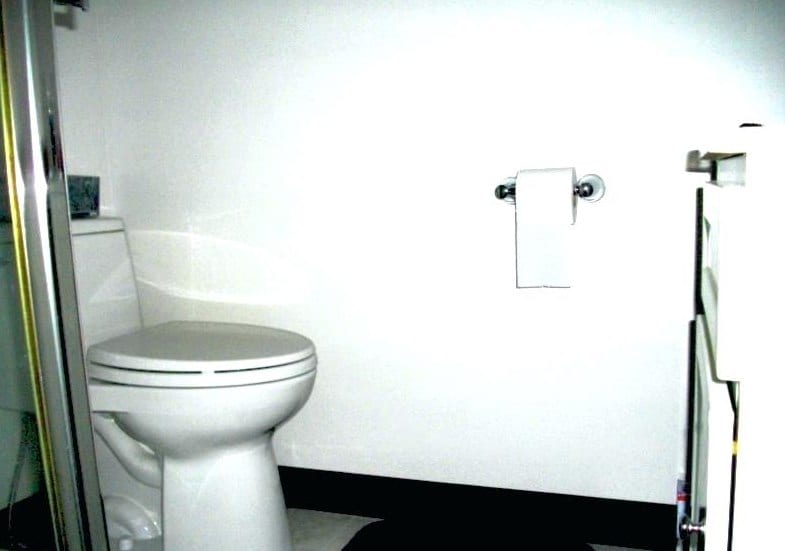
This bathroom designer must have really long arms or believes in making people work for it when using the toilet. I guess if you are small or a kid then you better grab some toilet paper before you sit down.
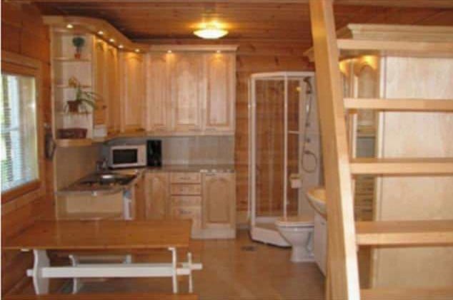
35) Toilet in the Kitchen
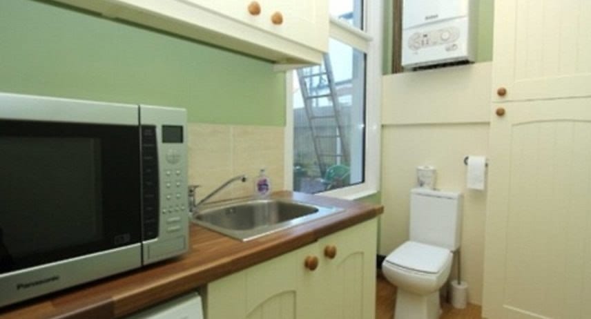
What is it about toilet placement in other rooms other than the bathroom? It seems that this homeowner found it necessary to place it in the kitchen. I guess for some people, when you gotta’ go, you gotta’ go.
36) Window Size Does Matter
Um, no comment on the obvious shape of this window, other than was this intentional? It’s ah, interesting to say the least. I’m curious how it looks from the street or the neighbor’s house, especially with the lights on at night.
37) Do I wash My Hands Before or After?
Here is an interesting setup. This toilet is in the middle of the room with the sink behind it. How did this even happen? Has the person who designed this ever seen a bathroom before? Honestly, if you don’t have room for both, you need to choose one or the other.
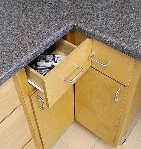
38) At Odds
Here is another example of idiots designing things. Whoever thought of this layout needs to be fired, or at least sent to design school. Maybe without the handles, this setup would have worked.


