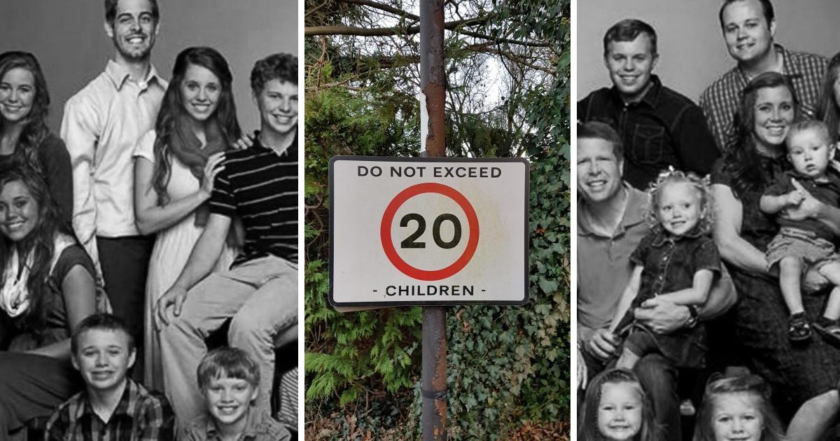
It’s not an easy job to be a graphic designer.
It’s really tough to get a message across, while also dealing with things like selecting the correct typeface or font, optimizing for readability, and making sure the colors look nice together. On top of that, you probably have some a-hole breathing down your neck and asking you to make things “more dynamic” or provide some other completely useless piece of feedback.
But when you finally have your finished product, you’re still not out of the woods. Your design still has to pass the test of being able to be read and/or understood by the public. If you’re good at your job, you’ve got nothing to worry about.
Otherwise, things could end up looking pretty bad.
A note to all graphic designers:

via: Reddit
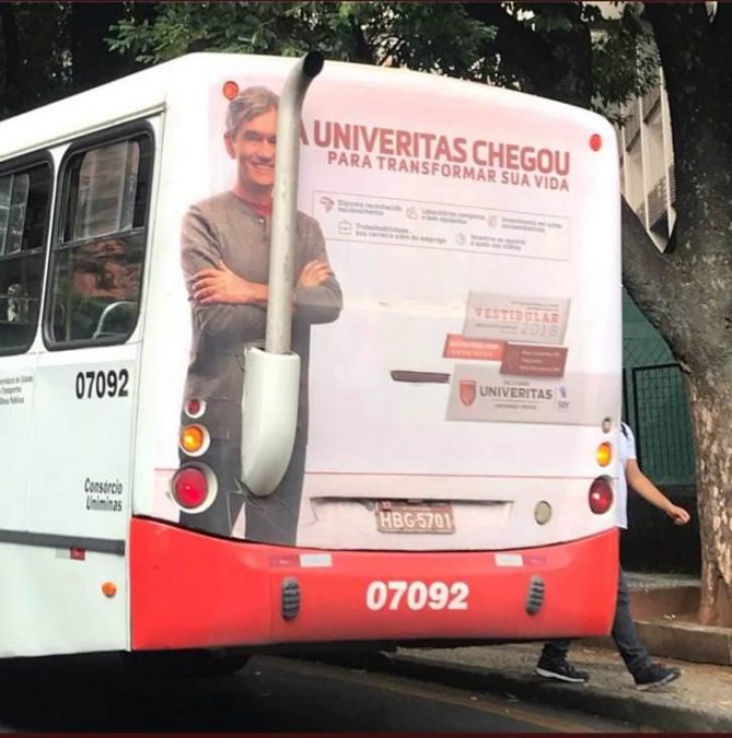
Putting a person’s face on the side of a bus is not inherently a bad idea!
Just make sure their eyes don’t end up on any moving parts. That’s all I ask.
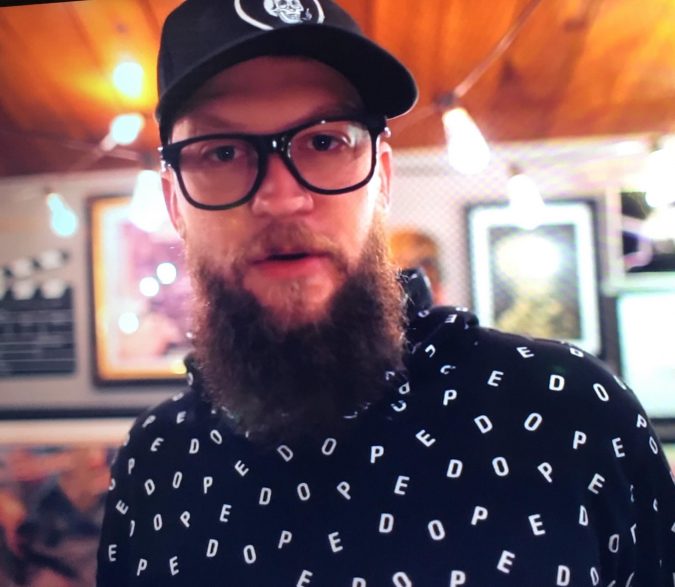
His shirt is supposed to say “DOPE.”
via: Reddit
Unfortunately, it also says “PEDO.”
Whoops!
Perfect.
via: Imgur
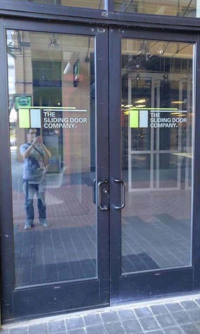
To be fair, I guess this one isn’t exactly the graphic designer’s fault.
But someone definitely messed up here.
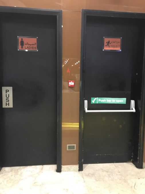
One of these is a sign for the women’s restroom.
via: Reddit
The other is for the emergency exit.
And that’s how you ensure the alarm goes off multiple times a day.
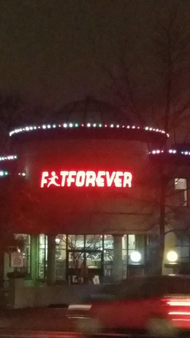
Is that an I or an A?
via: Reddit
Next time, it might be worth taking another look at your typeface before you make a huge, lit sign for a public building.
Just saying.
This guy’s having a good day.
via: Imgur
You know how I can tell?
Because of his huge smile!
Actually…
via: Reddit
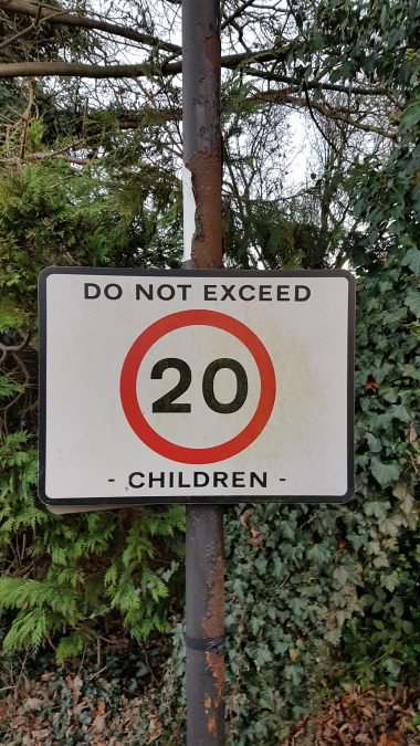
That’s not terrible advice.
Not sure what it’s doing on a road sign, but I think I’ll follow it anyway.
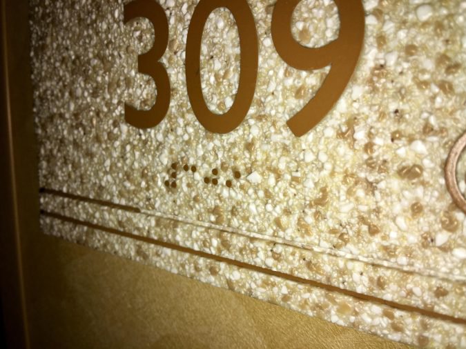
Braille on a bumpy surface.
via: Reddit
I’m sure this will never confuse anyone, ever.
Great work, guys.
This is what happens when you don’t pay for stock images.
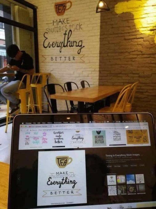
via: Reddit
Although I would have skipped this one, anyway.
Even without the Shutterstock logo, it still has a typo! (Should be “makes” instead of “make”!)
Do you like minimalism?
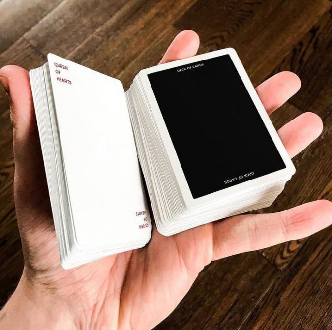
via: Imgur
I’m actually a big fan of minimalistic design.
But this? This is going too far.
Fair question.
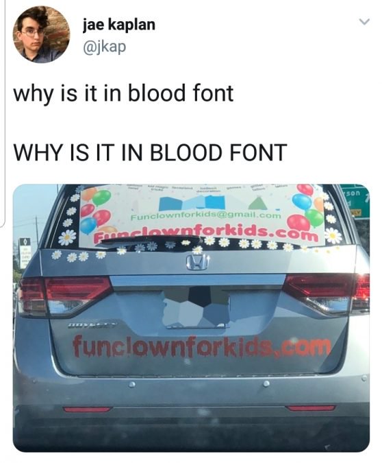
via: Imgur
Like, if I had to choose ONE font that should definitely never be used to advertise a clown for children’s parties, it’d probably be that one.
What were they thinking?
Uhhh, Spider-Man?
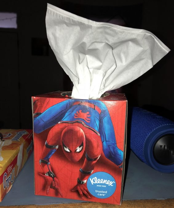
via: Reddit
I mean, I knew he could sling webs.
I just didn’t realize that’s where they were coming from.
Say again?
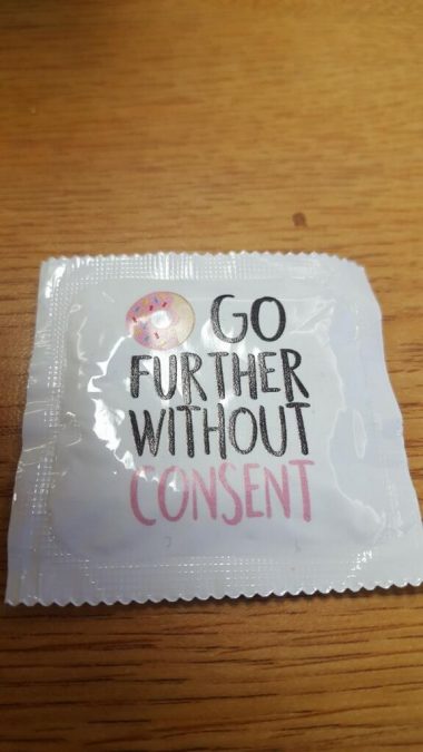
via: Reddit
So, this is a condom wrapper. The donut is supposed to make it read, “Do not go further without consent.”
Instead, it looks like it’s encouraging people to sexually assault other people. Perhaps in the hopes of getting a donut. Major oops.
Oh no.
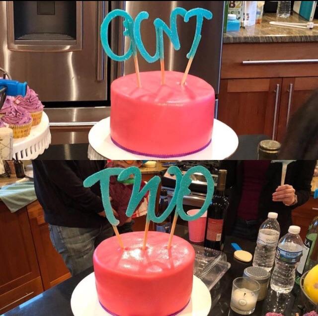
via: Reddit
Note to self: Make sure to view every cake topper you ever use in your life from all angles.
I cannot stress this enough.
Uhhh…
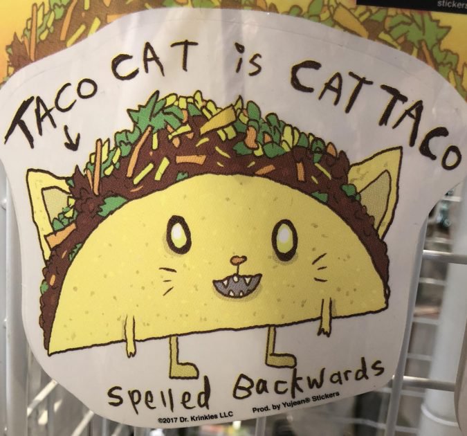
via: Reddit
No, actually.
It super doesn’t.
That’s what I think of your résumé!
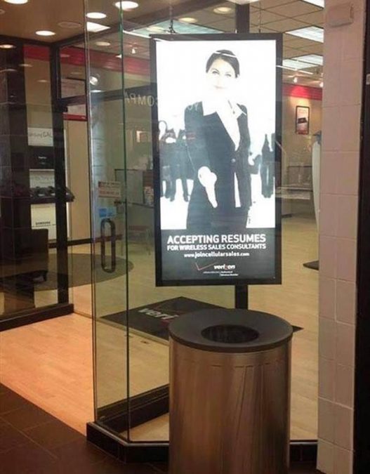
via: Reddit
If you’re looking for a new job, I highly recommend checking out online postings and asking your friends whether they’ve heard of anything.
I don’t recommend going here.
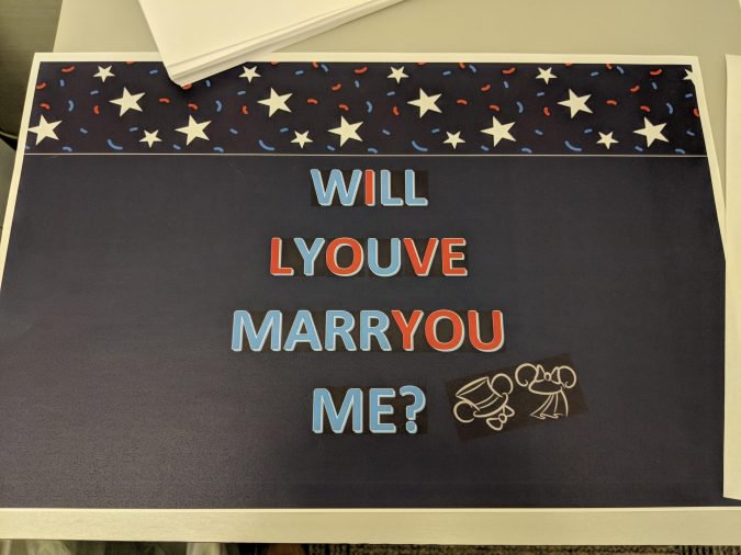
It seems like a lot of work went into this.
via: Reddit
And yet, it makes approximately zero sense.
I understand what they’re going for; I’m just saying their partner is probably going to have to do some real soul searching before they answer.
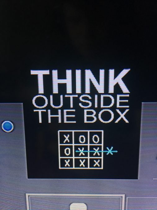
Think outside the box.
via: Reddit
Or, you know, sometimes thinking inside the box is good, too.
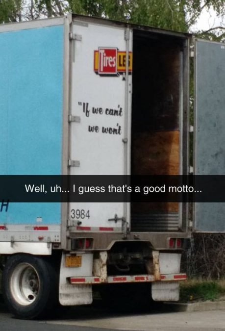
“If we can’t, we won’t.”
via: Reddit
I actually like this motto.
I like a company that knows its limits.
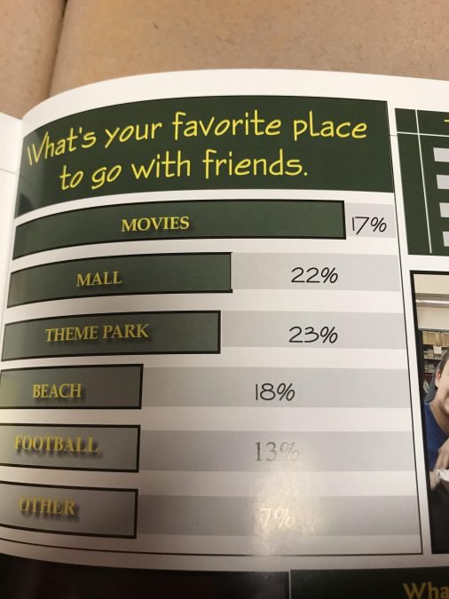
This is not how bar graphs work.
via: Reddit
To be fair, I learned about bar graphs a pretty long time ago, but I am like 80 percent sure that you’re not just supposed to make them random lengths.
Suspicious quotation marks much?

via: Reddit
These “people” “really” don’t “understand” how “quotation marks” work.
I would probably look elsewhere for your vacation destination.
We’re doing what now?
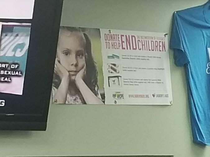
via: Imgur
I suppose that if we end children, we’ll also be ending all of the problems that children may face.
Still, seems a little drastic if you ask me.
Check out this guy’s hands:

via: Reddit
I’ve heard he’s a very hands-on professor.
I’m not sure if that’s a good thing.
It’s supposed to say “CLOCK.”
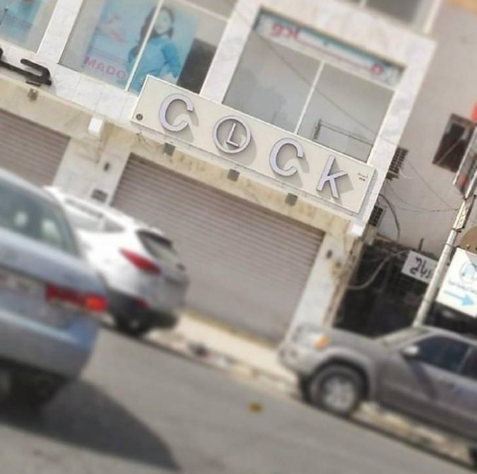
via: Imgur
Another note to graphic designers: Every once in a while, you may get the urge to do something that you think is exceedingly clever.
Please don’t.
“You Are Alone”

via: Reddit
Person 1: How can we make our banner really stand out?
Person 2: Let’s make it pink!
Person 1: Great idea! And how will we make the word “Not” stand out?
Person 2: PINK!
Ouch.

via: Reddit
I’m no doctor, but I’m going to go out on a limb here and say that this woman’s elbow is in pretty rough shape.
Perhaps she threw it out while trying to play a game with those GIGANTIC controllers.
Nothing Is Possible.
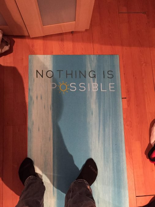
via: Reddit
I mean it.
Turn around and go home.
Stop shaming the tuna!
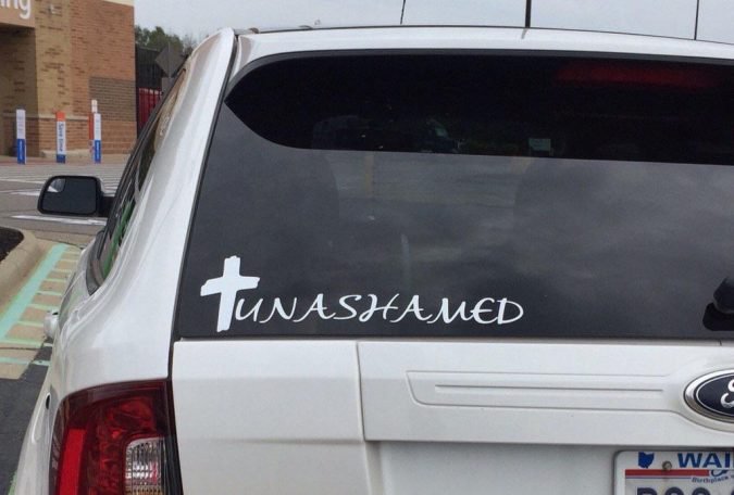
via: Reddit
Don’t you know that tuna died for your sins?
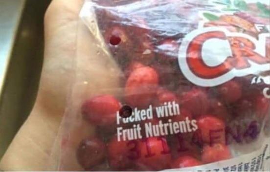
I BEG YOUR PARDON?
via: Reddit
Ohhh. Packed. PACKED with fruit nutrients. Carry on.
Share this with your most artistic friend!


